Erste bank
From Complexity to Clarity

The anatomy of simplicity through a loan selection product

  • Research
  • UX design
  • Prototype
  • UI design

For many people, taking out a loan is not just a financial decision, but an emotional burden. Faced with countless products, lengthy descriptions, and unfamiliar terms, one key question remains at the end:

Am I making the right decision?

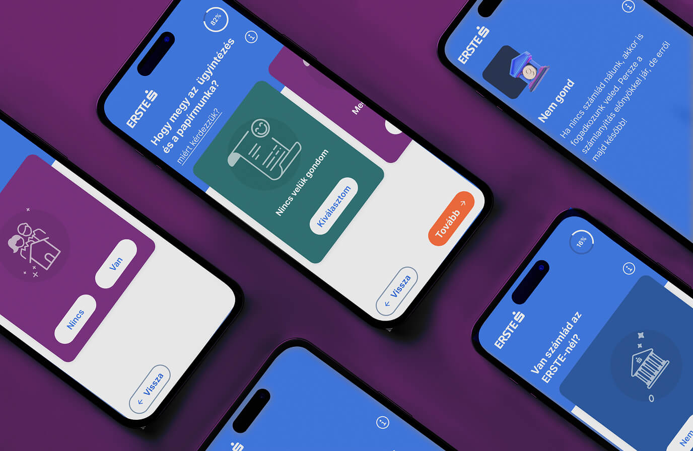
In this case study, we present how we moved from a complex banking challenge to a clear, educational digital product, created as part of Erste’s loan campaign.

The challenge

Our client, Erste, planned a multi-channel campaign to promote its loan products. A key element of the campaign was a new website that would serve as the main destination for interested users.

This platform had to fulfill several roles at once:

  • clearly present different loan products,
  • help users choose the most suitable option,
  • provide pre-calculation capabilities,
  • and support the initiation of the loan application process.

All of this needed to be delivered in a way that remained simple, transparent, and easy to follow – even for users with little or no financial knowledge.
Education was also a key aspect: the platform had to not only inform, but also help users make more confident decisions.

The problem

The world of loan products is inherently complex. There are many different types, each designed for specific purposes, with varying conditions – loan terms, APR, eligibility criteria – all of which differ from product to product.

Even a single product requires a significant amount of information to understand. When multiple options need to be compared, this quickly becomes overwhelming. Users often get lost in the details and struggle to see meaningful differences.

This is further complicated by the fact that most users lack deeper financial knowledge. In many cases, even basic concepts are unclear, making the decision not only complex but uncertain.

On top of that, users often don’t know which type of loan suits them best. They are not only choosing between options, but also trying to assess whether a given product fits their lifestyle and habits.

Finally, taking out a loan is a high-stakes decision for most people. This naturally introduces stress, making the decision process even more difficult.

Research

We started with a best practice review of existing market solutions. While many loan comparison platforms exist, they do not truly support decision-making. Most simply compare offers from financial institutions, but do not help users understand which loan is right for them. We found no solution – either locally or internationally – that addressed this gap.

However, we identified inspiration from a completely different domain: dating apps like Tinder. Their simple, intuitive, decision-driven interaction model offered a compelling parallel.

Our qualitative research included interviews with professionals directly involved in loan processes, such as bank advisors and product managers, as well as users who had recently taken out a loan or were planning to do so. We used AI-supported tools (such as Dovetail and tl;dv) to analyze interviews, helping us quickly identify patterns and extract key insights.

We also revisited previous deep research conducted for Erste, focusing on user decision-making situations. Additional insights were gathered through netnographic research and analysis of customer service complaints.

Finally, we used AI (Gemini) to process product documentation and extract the key attributes relevant for decision-making.

The idea

Our research made it clear that most existing solutions assume users are willing and able to compare financial products in detail.

In reality, this is rarely the case.

Most people don’t want to analyze products – in fact, many are not even aware of the available options. What they really want to know is:

What is the right decision for me?

So instead of starting with products, we started with the user.

01
Loan Tinder

We map the user’s needs and possibilities, and based on a predefined rule system, recommend suitable products.

02
Loan Selector

Based on the Loan Tinder results, we display a filtered list of products, where the filtering can be adjusted or overridden.

03
Detailed information

For each product, the key information required for decision-making is available in a clear and accessible format.

04
Calculator & Application

At the end of the process, users can perform calculations based on their selected options and proceed to start the application.

We identified what we called internally the „complexity problem”: users are overwhelmed by the volume of products and information, leading to confusion, drop-off, or reliance on advisors.

Our solution was to gradually introduce information, guiding users step by step through the process and avoiding cognitive overload.

The journey begins with a short, question-based flow designed to understand the user’s situation. At this stage, we deliberately avoid jargon and detailed financial data – only the information necessary for the current decision is shown.

Where needed, the system explains key concepts in simple terms, introducing education from the very beginning. This aligns with Erste’s mission of promoting financial health. Educational content is always contextual and minimal, ensuring users are not overwhelmed.

Based on the answers, the system narrows down options and provides clear recommendations:

  • which products are most suitable,
  • which are still viable options,
  • and which are not recommended.

Users are then presented with a filtered, easy-to-understand list, with optional access to detailed information.
Finally, a calculator helps users make a concrete decision and even start the application process online.

The twist

We quickly turned the concept into a prototype and presented it to the client.

That’s when we realized the real challenge was not just the user experience. Behind the scenes, the decision logic involved a highly complex network of conditions and branching paths. This made it difficult to manage, especially considering that loan products frequently change – new ones appear, others are discontinued.

It became clear that we were designing for two audiences:

  • the end user, who needs a simple experience,
  • and the client’s internal teams, who need to build, manage, and maintain the system.

This led us to design a backend solution that is not only usable but also structured and manageable.

We envisioned a system capable of handling complex decision logic in a transparent way, and even transforming it into testable user flows – making it easier to validate, maintain, and evolve over time.

The solution

The final solution operates on two levels.

On the front end, users experience a simple, guided flow that helps them make decisions through a series of questions, followed by a filtered product list and calculation tools.
In the background, a structured logic system manages product conditions, decision rules, and resulting recommendations.

This was not a one-off design effort, but a multi-month collaboration with the client. We continuously iterated on the concept, creating and testing multiple prototypes, and refining the solution based on rapid validation cycles.

This approach made it possible to:

  • easily update the system with new products,
  • enable multiple experts to work on it in parallel,
  • and keep the entire process testable and maintainable.

The results

The outcome is a digital product that significantly simplifies the loan selection process. Instead of facing an overwhelming set of options, users are guided step by step, receiving only the information they need at each moment. This leads to clearer understanding and more confident decision-making.

On the client side, we delivered a structured, rule-based system capable of handling product conditions and decision logic efficiently. The solution is flexible, scalable, and easy to maintain through collaboration between multiple stakeholders.
End-to-end measurements showed outstanding conversion performance, clearly validating the effectiveness of the approach.

The client was highly satisfied with the result, especially appreciating the clarity and simplicity of the solution. For us, this is a project we are particularly proud of — successfully transforming a complex challenge into a product that creates real value for both users and the business.

Takeaways

One of our most important learnings was that while AI can significantly enhance many aspects of the process, it is not a universal solution.

We initially aimed to rely heavily on AI for the recommendation logic. However, in practice, this proved problematic in a financial context.

  • AI-generated recommendations were not reliable enough. Outputs could be inconsistent or inaccurate, and identical inputs did not always produce the same results — which is unacceptable in a system involving financial decisions.
  • It also lacked sufficient control over business priorities, such as product ranking or eligibility conditions.
  • From a legal and operational perspective, the lack of transparency and traceability posed serious risks. In cases of customer disputes, it would be difficult to explain how a recommendation was generated.
  • Additionally, relying on third-party AI services introduced concerns around reliability and cost.

As a result, we shifted to a hybrid approach: using AI as a supporting tool (for research, analysis, and data processing), while keeping the core decision logic within a controlled, rule-based system.

Ultimately, we learned that a successful digital solution must work not only for users, but also for the organization behind it – meeting business, legal, and operational requirements.

And perhaps most importantly: Users don’t need more information – they need more confidence in their decisions. A well-designed, guided experience can provide that far more effectively than any technological shortcut.